NOTE: The vote is over, this page is no longer live.
Vote!
The Wiktionary logo will be chosen using approval voting. The vote will last from September 8 to September 21. You may vote for as many logos as you like, but cannot vote against a logo. The top three to five ideas will move to the second stage. Anyone may vote, but must use either a Meta account, or provide a link to their accounts on another project.
At this stage in the voting, only choose the idea which you prefer; the exact variant will be chosen in the second stage of voting. Votes are tallied in the "Votes" subsections underneath each of the 19 proposals on this page. (See the table of contents below, or the Gallery.) To leave a vote, write # {{support}} in one or more of these sections, followed by an optional message, followed by your signature or a link to your userpage on another project.
For all logo discussion and submissions, please keep in mind the following requirements:
All logo submissions must not be licensed under GFDL but the copyright must be assigned to the Wikimedia Foundation (use {{CopyrightByWikimedia}} for uploads on Commons)
The logo should be circular or have a circular main part, have blueish colour tones, a part which can be used independent from any language (by removing the actual local name of the project), and so on. (quote from Nightstallion)
Firstly, I don't know if we really need a new Wiktionary logo. I personally really like the current one, although I do sympathise with the points about it being language-specific and text-based.
If a new logo is really required, I would like to suggest one of those suggested for the Wikisource logo, [[3]]. It is ambiguous enough to easily apply to Wiktionary if needed, and it is both simple and eye-catching. Underneath could be (why is it always underneath?) the text (with IPA if you really want it) as it is in the 'definition' now. — The preceding unsigned comment was added by Dbmag9 (talk) Who apologises sincerely.
Mh. I don't really like that specific execution of the logo, but I'm not opposed to its design in principle; if someone with graphics skills would execute a logo based on this one which fit in better with the others... ;) —Nightstallion(?)07:14, 13 June 2006 (UTC)[reply]
I wasn't particularly unhappy with the existing wikt-logos, but then, if we find something better... IMHO a logo need not be symmetrical, nor must it necessarily remind of other wikimedia logos. What I like about the current logo(s) is that it contains typical dictionary-elements: typographical diversity (different fonts for different parts of an entry), abbreviations, based on text/script/writing.
How about a logo that has an (international) graphical part (e.g. a rectangular, coloured bit) and a language-specific part (e.g. the head of an entry in that language: word, Wort, mot, verbum, söz etc.) with different fonts for lemma, abbreviated grammatical info, IPA transcription, (beginning of) definition. The text part could be inside the graphical part, or seem to "grow" out of it. Font colour might be nice (but not different font colours). What d'ye think? --89.53.222.16019:14, 13 June 2006 (UTC) (jonas from de.)[reply]
We must distinguish those 2 things : the logo itself (symbolic, with colors etc.) which would be the same for all the projects, and below the name Wiktionary in the language of the project, followed by the slogan (different between the projects too...). So what we want to do is only the logo, that will be adapted to all the projects. - Darkdadaah16:13, 15 June 2006 (UTC)[reply]
Though I do like both the former and the proposed ones, I'm not really satisfied with the stylized W, because it looks somewhat Roman-centered — I would instead suggest either juxtaposed Roman and Chinese characters (the most used worlwide, if I guess well), or simply none at all. Why not try an open book (something like #5 shown in the gallery) that would let hundreds of words of different languages escape excentrically, in both senses of the term? Korenyuk
Shin is not a W
In the proposed logos which involve examples of the letter W in other alphabets, many of them incorrectly use the hebrew letter Shin as a W. Shin is not a W, it is a Sh. The nearest the Hebrew alphabet gets to a W is with Waw. Please could everybody make sure that they use this in their logos that might involve the many Ws concept, as to anyone who knows Hebrew, a Shin among Ws would simply look odd. --Ω21:16, 17 September 2006 (UTC)[reply]
Yeah, but it's not too logo-esque, either... It's also very similar to the Wikibooks logo (which I would also like to change slightly). Mh. —Nightstallion(?)05:51, 14 June 2006 (UTC)[reply]
None of the Wikimedia-projects is a book. I know that the German WM-Organization has published some Wikireaders (collections of WP-articles) in print, and that a German publisher planned to do a paper edition... Still, the projects are wikis. It's a central idea. Even if you use books only as symbol for knowledge in a logo, it somehow collides with the special characteristics of the projects. --89.53.198.19714:26, 14 June 2006 (UTC) (jonas on .de)[reply]
The 'book' meme makes me think fof something more liki a WikiBibliography project or something. I don't think it's appropriate for Wiktionary. SMcCandlish20:51, 21 July 2006 (UTC)[reply]
Clichés
One thing I'd like to avoid is the cliché "Wiktionary: Noun. 1. A dictionary..." type of logo. As Wiktionary carries words in all sorts of scripts and languages, I was thinking of possibly, something along the lines of:
W
i
k
t
i
o
n
a
r
y
维
基
词
典
श
ब्
द
क
ोष
В
и
к
и
с
л
о
в
а
р
ь
V
i
c
t
i
o
n
a
r
i
u
m
ウ
ィ
ク
シ
ョ
ナ
リ
ー
Or, more simply
Wiktionary
维基词典
शब्दकोष
Викисловарь
ウィクショナリー
All the words spell out Wiktionary in English, Chinese, Hindi, Russian, Latin and Japanese, although other languages could be used instead (ideally I'd like one in each alphabet. They'd probably all have to been in different colours/shades of grey to stand out against each other. The letters in bold were meant to be a giant W, but they didn't come out very well, so ignore that). Smurrayinchester17:46, 14 June 2006 (UTC)[reply]
I'd be *strongly* against making it so word-based. It's supposed to be a logo, not a textfile. The current Wikipedia logo manages to have a few letters and still be a logo, but that's far to much in my book... —Nightstallion(?)18:16, 14 June 2006 (UTC)[reply]
What I'd say inresponse to you, Nightstallion, is that the reason the Wikipedia logo is a logo, & not text is because it has other things than just text, not to say I like the Wikipedia logo at all. I actually just don't like how '...The letters in bold were meant to be a giant W...'; I smell cultural imperialism........----______----
Something to keep in mind: We won't necessarily need a logo which can be changed to reflect various language editions in the long run, as in the end, there will be a single multilingual Wiktionary (or so I understand it). —Nightstallion(?)07:57, 4 July 2006 (UTC)[reply]
Are you certain? I was under the impression that all Wiktionaries would be merged into the Ultimate Wiktionary/WiktionaryZ once it was finished (which might still take years, though). Your source? —Nightstallion(?)16:27, 4 July 2006 (UTC)[reply]
The content of the current Wiktionaries will be imported into WiktZ but they will still exist. Greetings Pillδ11:24, 5 July 2006 (UTC)[reply]
It is up to people and communities to decide where they want to be active. This may mean that people move over to WiktionaryZ. It may mean that some communities end their project as a Wiktionary and merge into WiktionaryZ. For me, it is up to them; WiktionaryZ is designed to host the information that exists in the Wiktionaries but it is not designed to end the Wiktionaries. GerardM20:04, 5 July 2006 (UTC)[reply]
Logos should not include the letter 'w' (or 'wz') unless it is expected that each language will change it to the appropriate letter for that language - imho a very bad idea, given that the point of the logo is to give a unified identity to the project. --HappyDog19:44, 6 July 2006 (UTC)[reply]
Not a bad idea in my opinion. The current logo has been adapted to each Wiktionary's specific language while still retaining the characteristic looks. That's what I like about it, and I think it'd be great if something like that could be preserved despite a logo change. The text buble is the central image, and each Wiktionary could fill it in according to their language. I understand why people think that's a bad idea, but I quite like it. Vildricianus08:40, 11 July 2006 (UTC)[reply]
Yes, but quite a few Wiktionaries haven't got a translated logo yet, and some languages will just not fit into one of our current designs. The Wikipedia logo contains enough letters to make it look international, but the other successful logos are non-linguistically based. I personally still prefer the faces logo to the others, because it is completely universal (except perhaps to those outside the human race :).Daniel (‽) Check out Wikiscope! 09:00, 11 July 2006 (UTC)[reply]
Speaking of WiktionaryZ (and this is probably the wrong place), but can we use [4] as the logo for it? Do I need permission? How do I request it? Thanks! --Celestianpower (en, wikt) 22:21, 12 July 2006 (UTC)[reply]
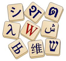
Proposed "Scrabble-Mah Jong" style logoIn JapaneseFlat printable version Something possibly like this. The fact that the Latin W is in the centre and red indicates that this is primarily a Latin text Wiktionary; the Japanese wiktionary for example then simply move around the W and the シ to indicate that it is primarily a Japanese wiktionary and so on. The shapes will also scale well when used as an SVG file as they are mainly simple geometric forms and vector fonts. Smurrayinchester18:53, 15 June 2006 (UTC)[reply]
Yeah - I love it - it's the best of the lot that have appeared so far. The first thing I think of when I think of words is w:Scrabble, so in this respect perfect. I also love the customisability in terms of the different writing systems. Beautiful, and you've got my vote :). --Celestianpower (en, wikt) 15:25, 19 June 2006 (UTC)[reply]
Err, this one's indeed the best so far, but why is such an obscure Cyrillic letter used? I mean the "Њ" thing - it's only used in Serbian and Macedonian. Why not consider some other Cyrillic letter that's characteristic for most of the languages that use this alphabet? Like "Ж" or "Ш"? Todor→Bozhinov
My only qualm with this one is the overall shape. Couldn't you group the tiles together (throw them on top of each other, maybe increase the perspective a bit) in order to form some kind of (presumably triangle) balanced form? As it is, it's nice and clean, but hard to support because of the focally boring placement of the tiles. There could be some symbolism in the placement of tiles as well, with older alphabets higher up and more modern alphabets emerging from underneath, hinting at the influence historical languages have on modern speech. freshgavinTALK03:39, 20 June 2006 (UTC)[reply]
I like this idea, and I suggest you add korea characters and other representative characters. But not to much!--Vipuser03:50, 20 June 2006 (UTC)[reply]
The only problem I see with this is that it may become overloaded if we add too many different alphabets, and that it may be unfair to exclude specific scripts... Apart from that, a more circular arrangement of the tiles might be nice, but in principle, it's still one of my top 2. ;) —Nightstallion(?)06:01, 20 June 2006 (UTC)[reply]
It is just a sketch; I just chose Њ because it was the first Cyrillic letter I found. I've made a sketch of Freshgavin's idea, although it may need some tweaking to make the text on the lower layers more visible. I can't add any other scripts (besides Korean, which I have done), as these are the only ones which work on my computer, but more localised ones, such as Armenian and Burmese, could always be added by the localised Wiktionary to the top of their pile. Smurrayinchester07:49, 20 June 2006 (UTC)[reply]
I'm a little concerned that the reference to Scrabble may not be a good idea. It's a little culturally biased, and implies an iconic status of the game that many may not see. Maybe I'm just too used to the excessive neutral, non-corporate workings of the BBC though (although maybe if it's a close call you could see if Hasbro would pay the Foundation to swing it towards the Scrabble one!). Just a thought. w:User:Bigbluefish16:11, 20 June 2006 (UTC)[reply]
Well, the original idea was to base it on anagram tiles, which are a bit like scrabble tiles, but without the scores on. But since the colours I chose made them look Scrabbl-y, the name "Scrable logo" has stuck... Smurrayinchester11:22, 29 June 2006 (UTC)[reply]
For a favicon or sister projects version of this logo, you could keep only the central W or シ tile. Note that the Wikipedia logo also favors certain scripts over others; that logo just has enough room to feature more scripts, that's all. – Minh Nguyễn (talk, contribs) 19:37, 25 June 2006 (UTC)[reply]
I like this single tile better than any of the collections. Maybe if the primary, central tile were brought closer to the camera, that is, if it were significantly bigger than and partially hid the others, then you could use the same image throughout. 59.112.42.23020:00, 28 August 2006 (UTC)[reply]
The scrabble pieces are a good idea - gives a nice complement to the wikipedia puzzle pieces, too. One suggestion: What about a version which incorporates the project name _in_ the pictures? such as "random scrabble pieces around and in the middle some forming the text "wikt" (wiktionary probably would be too long...)? --Elian15:50, 11 July 2006 (UTC)[reply]
I would like that version too, but that might increase the temptation to use a "U" or "シ" for other languages; if the logo's only letter is changed, the logo is very different across wikis. – Minh Nguyễn (talk, contribs) 03:23, 20 July 2006 (UTC)[reply]
I really like this proposal and would like to suggest a minor change:
Wiktionary is not about the diversity of typefaces. For any proposal that features several scripts' graphemes such as this one, having all of them in a similar typeface might add to its usability and overall appeal.
I guess the style of choice in terms for logos that are mainly seen on computer screens would be equal stroke width, sans serif – or hēitǐ/gothic/dodum for CJK graphemes; besides typeface issues, perhaps the Greek grapheme would fit in better if it were an upper case one.
In the images displayed, the top row graphemes (Kana and Brahmic) are shown in equal stroke width fonts, whereas the other two rows show graphemes in serif fonts of different stroke width, and a simplified hànzì in a sòngtǐ font.
If it isn't too much work, I suggest to change the 2nd and 3rd rows to use equal stroke width fonts – that is, the Hebrew grapheme should look like an Arial one, the Arabic grapheme like a Tahoma one, the hànzì like a SimHei one etc.
Unfortunately, I don't know where to get the necessary fonts (except for nice GPL fonts for Hangeul, which is currently not included).*
The above suggestion applies to any similar proposal to be made (see #4, #10); I merely post this thought here because this is the first proposal and because it seems to enjoy some support. Thank you for reading this. W. 2006-07-21
*On second thought, we don't need fonts – if there are only so many graphemes in the logo, they can be hand-made individually. Of course, fonts would come in handy for logos such as Wiktname.png that contain more text in the same style as on the scattered pieces, where it would be too tiresome to mold letter shapes individually. W. 2006-07-21
I like the one with the normal text "Wiktionary", without beeing inside the little blocks. I would only like it with black text. --201.17.164.22915:24, 23 July 2006 (UTC)[reply]
I also like the version with plain text below, but I would prefer if the project name and tagline would be set in a font and color similar to Wikipedia's logo. The current image looks too close to Times New Roman for me... :^) – Minh Nguyễn (talk, contribs) 21:08, 25 July 2006 (UTC)[reply]
I agree: all fonts should be matched alphabet-for-alphabet with the Wikipedia logo. Also, I think the tiles themselves need to be redone (change the colour, lose the black border strokes) to match the sister logos, particularly Wikibooks. Seahen06:15, 28 July 2006 (UTC)[reply]
Unfortunately, I couldn't find the Wikipedia font on my computer. Times New Roman was the closest. No other projects use the Wikipedia font, mind you. Wikispecies has a futuristic font, Wikiquote is calligraphic and Wikinews is a sleek sans-serif. Smurrayinchester18:06, 1 August 2006 (UTC)[reply]
Well, I understand that these images are still mockups. But maybe one of the Wikipedia logo's designers could offer to add that text in the Wikipedia logo font. – Minh Nguyễn (talk, contribs) 08:54, 8 August 2006 (UTC)[reply]
I think this is a great concept, really adaptable and usable in many contexts. You could have them as scrabble pieces, mahjong, runes, tokens, pyramids, first-aid style crosses, christian style-crosses, star of davids, moon stones, interconnecting circles, discs, an interacial-coffee-coloured-tribe-of-dancing-circle-hand-holding-hugging-humans... whatever!! I think it's great. But then again, I'm just a grrl... ;) Craybee 12:38, 15 August 2006 (UTC+1200)
I've created SVG versions of the file (there appears to be a small problem with the chinese character causing a small black artifact, but I can deal with that later). I've also created a more modern looking one, which the San-Serif font suggested above. I can also mix and match fonts to get the best representation of each figure. Smurrayinchester14:36, 20 August 2006 (UTC)[reply]
Without the subtle gradient, your Classic variation doesn't seem nearly as polished as the original proposal (the non–"flat printable version"). I think it'd work at smaller resolutions, though. – Minh Nguyễn (talk, contribs) 04:02, 21 August 2006 (UTC)[reply]
The shin (ש) is not intended to be a W; I choose it purely out of aesthetic convenience, clarity, and the fact that the arabic letter I choose also happened to be shin (ﺵ). Lambda (λ) and shi (シ) are also not Ws, in fact the only W here is W, which I am considering changing to an A, as not all Latin languages have a W (Catalan doesn't, for instance). Smurrayinchester06:34, 20 September 2006 (UTC)[reply]
Votes (40)
Support my second choice but I like it; the 'ae' one is my first choice. I would advocate choosing a tile other than the 'w' for the favicon, maybe an 'ae' tile. --Rogerhc22:51, 18 September 2006 (UTC)[reply]
Support, though I particularly like it with the name of the project below, such as Wiktionary, शब्दकोश, etc. That could be separate if possible so the main logo wouldn't need to be redone hundreds of times. - Taxman12:34, 12 September 2006 (UTC)[reply]
conditional support only if the center tile W is brought closer to the viewer, and understanding that the choice of characters etc. is to be decided. Davilla03:02, 15 September 2006 (UTC)[reply]
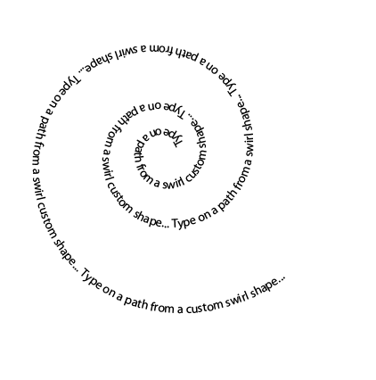
And idea my girlfriend came up with would be to have some text (not necessarily the same we've got now, we might want to opt for something more neutral involving different scripts and languages, or even something that doesn't use words but simply letters and signs from different languages, like in the Wikipedia logo) aligned in a spiral-like shape, somehow like this, but with the text more closely aligned like in this picture to give it a more circle-like feeling; how much and what kind of text we could use would be for later to decide. What do you think? —Nightstallion(?)05:48, 12 June 2006 (UTC)[reply]
I thought in a simplistic logo, as a man reading a green book, with the
Wikimedia Foundation colors. Can someone help me creating its SVG version? Diego UFCG09:54, 15 June 2006 (UTC)[reply]
Well, Wikispecies' and Commons' logos are also very similar to Meta's, without being too close. I like the idea, but I'd also like to see a few different ideas. But still – we have our first actual draft. =] —Nightstallion(?)18:39, 15 June 2006 (UTC)[reply]
Okay, I didn't even realise what this logo could have possibly been until I read the description. Now that I know what it is, I like the idea, but maybe something a little bit more obvious? --Firehazard0705:03, 17 June 2006 (UTC)[reply]
I like it as well, looks nice and clean. I agree that the book imagery lacks justification though. If he was writing I think it would make more sense, but it's hard to think of a way to illustrate anything more complex without ruining the simplicity. freshgavinTALK03:32, 20 June 2006 (UTC)[reply]
Sadly, I think it looks way too much like a poke'ball. --Snarius
I like this proposal most. It is simple and plain and therefore easily rememberable. And if you don't like the book, then view it as a screen. It's an online dictionary! You see, there's no problem ;-) --::Slomox::><15:58, 27 June 2006 (UTC)[reply]
Pikachu, I choose you! Sorry, but this looks like a Poké Ball to me too. Now I know it's a person, yeah, I can definitely see that, but I'd never have worked it out myself. It's a beautiful design, but the logo should have a mental response of "oh, that's a ____", not "what the #$%& is that supposed to be?!" Garrett22:04, 28 July 2006 (UTC)[reply]
So far, this is visually the best especially on the thumbnails and smaller versions - simplicity is something difficult to achieve :-) my vote --Diligent07:54, 2 August 2006 (UTC)[reply]
I like this one, however it may be too similar to the Foundation (Meta) logo. There have been problems with the Incubator logo because it was too similar to the Foundation logo, but there we could say the Incubator is very close to Meta anyway. For a whole seperate project that would not be the case, and so there could be problems. Daniel (‽) Check out Wikiscope! 09:41, 2 August 2006 (UTC)[reply]
It's nice, but the globe looks a bit busy, and I don't like that it seems to be a software icon (even if it is free). Could this be simplified a bit? Smurrayinchester06:53, 16 June 2006 (UTC)[reply]
Just an idea - this image is already in free use throughout wikimedia. but something like this would be good. --Alfakim17:08, 17 June 2006 (UTC)[reply]
I disagree with Smurrayinchester. The fact that it's based on an icon gives the creator(s) of the icon something to be proud of, and it's a high quality stock icon, which means the logo will be sleek indeed. With a little rearanging of letters to show the countries where they are used (i.e. an "a" over the US/Britan, wherever else English is used), and the logo's done and sleek.--Mac Wanter23:21, 21 July 2006 (UTC)[reply]
I like that one : the earth surrouded by a (unclosed) circle with different characters... It seems to mean that every language on Earth can be in Wiktionary (which is the purpose). To improve this, I suggest to find a way to show that it is in construction (like Wikipedia logo with pieces missing). - Darkdadaah18:07, 17 June 2006 (UTC)[reply]
Something else for others to work with. I envision black letters from other languages climbing up the blue ring, converging at the W. --Alfakim17:12, 21 June 2006 (UTC)[reply]
Mm. I don't like it that much anymore. Actually, I still don't think any of the proposals is a sound replacement of the current logo. We'll need some more ideas. Vildricianus16:07, 24 June 2006 (UTC)[reply]
This design will probably need changing for the reasons mentioned here.
How about this logo? It has a tidy, symmetrical outline and a prominent blue circular ring, and it uses only Wikimedia Foundation colours (and web-safe shades of grey). Also, we can add more letters from different scripts if desired.
I like it : Original, universal, understandable, but is not enough visible : Maybe with thicker lines. Book and Letters are redundant : maybe without letters ? Stephane888811:16, 7 August 2006 (UTC)[reply]
I didn't know which fonts Wikimedia would want for the Wiktionary, so I leave that section blank (unless requested otherwise). The idea is basically a dictionary. No singular language involved, used the wikimedia colors, already a vector image seen as a GIF or a PNG. The GIF image has a solid white background, whereas the PNG has a transparent background. Created in Illustrator, many different file types available at request. --Firehazard0705:43, 17 June 2006 (UTC)[reply]
GIFPNG
A similar proposal was made on Wikisource for a logo like this. The problem primarily is that it looks like clip art; it doesn't have any brand recognition for Wiktionary. Messedrocker07:02, 17 June 2006 (UTC)[reply]
This logo would suit Wikibooks perfectly imo; the similiarity to a rainbow (especially when shrunk down to a thumbnail) fits the nature of wikiprojects too - serving all the colours under the rainbow... Drrngrvy20:17, 12 July 2006 (UTC)[reply]
What if you make the bottom part of the book red as well so that the reader can see a "W" in the picture. I didn't test it; it may turn out horrid, but it may not. --Richman27121:03, 27 July 2006 (UTC)[reply]
Here is a selection of designs based on the same concept. Would be interested to hear your feedback. Thanks to NightStallion for getting in touch --HappyDog00:53, 18 June 2006 (UTC)[reply]
I like this one a lot, especially the first. Two people apparently speaking different languages green and blue and they meet in the red dictionary. Patio11:45, 19 June 2006 (UTC)[reply]
Without doubt (for me) the first one of these proposals is the best one. Wiktionary is about words, about making communication easier - about Nations who meet, talk, work together. It is far away enough from the other logos like the wikimedia and commons logo, but similar enough to show its parentele. It is maretable and easy to remember. The one with the globe above is not bad, but it is not unique - too many are using the globe to show globality. Showing communication is much better. --Sabine12:54, 19 June 2006 (UTC)[reply]
In fact, I'm also quite certain that the first version of this design would be the best Wiktionary logo from all those proposed so far. —Nightstallion(?)13:13, 19 June 2006 (UTC)[reply]
Very good logo (the first). I think this is on top so far. However, we need to be prepared for the rush of people who will inevitably complain that the people are not diverse enough. Daniel (‽) Check out Wikiscope! 17:33, 19 June 2006 (UTC)[reply]
Since I really like that logo, I tried to make some arrangements and some tests (svg versions). The second is a png since it seems that the font I used is not recognized by MediaWiki. - Darkdadaah16:29, 19 June 2006 (UTC)[reply]
Logo.Logo with text.Logo with text.Logo with Wikimedia colors.
As immature as this sounds, I think the red thing looks too much like a two-tailed sperm at first glance. :/ 203.177.60.23609:11, 21 June 2006 (UTC) (User:TheCoffee from en.wikipedia)[reply]
The silhouettes in Darkdadaah's "arrangements" look a lot better to my eye, same applies for the speech balloon. IMHO both balloon and faces don't appear "smooth" enough in HappyDogs versions. Still, neither version really convinces me... --89.53.238.21513:46, 24 June 2006 (UTC) = jonas from de.wikt[reply]
My personal preference is for Darkdadaah's face shapes with my, slightly rounder, balloon. Also, the colours in my version are the standard Wikimedia colours which I think (for consistency's sake) are preferrable to the slightly richer colours used in Darkdadaah's version. --HappyDog18:06, 27 June 2006 (UTC)[reply]
The more I think about this one, the more I think it is just too obscene. I mean, why does she have her leg spread like that, and why are those two guys crouched down in front of her thighs? Is this meant to be a logo for our very-very-very common vandals? --Connel MacKenzie19:54, 1 July 2006 (UTC)[reply]
Nothing wrong with making things a tiny bit provocative. If you have a dirty mind then most things look sexual. When I first saw the Wikimedia logo it looked to me like someone ripping open their shirt, therby revealing their naked torso underneath. --Dangherous23:35, 3 July 2006 (UTC)[reply]
I guess is should be possible to make it a little less provocative (I tried but my gimp skillz are still in its infancy): An obvoius change would be to turn the red blob into something more closely resembling a speech balloon - i.e. to turn it horizontal, maybe even make it a thought balloon to get rid of the "sperm tails" :) What may or (more probably) may not work in a small logo, is to split the balloon by an open book. BOTOH, that may get too cramped also in a large logo... \Mike(z)18:12, 12 July 2006 (UTC)[reply]
I don't understand why people think this is provocative. I've got a filthy mind, and even I have to make several leaps of judgement before I see this image as rude! --HappyDog13:10, 14 July 2006 (UTC)[reply]
I think that while this is an excelent logo, it would be better suited for Wikiquote than for Wiktionary. The logo makes it look as if the site deals with quoting people instead of giving definitions. --71.242.182.14119:35, 16 July 2006 (UTC)[reply]
Yes, that's why I had the idea with the speech balloon divided by a book, as in "the message has to pass through the book (dictionary) to pass from one to the next", but i fear it would be too cramped. (Maybe if we removed the faces altogether? A speech balloon with two tails, one half is blue, one is green; and in between; an open red book facing upwards... gah! I gotta learn how to make nice pictures myself since noone else seems to be interested in taking my hint to draw a suggestion like this.... ;) ) \Mike(z)09:03, 17 July 2006 (UTC)[reply]
This logo is not a good idea. It seems men spitting a two-tailed spermatozoon.
A calligraphy of Latin lettre "W" & Greek lettre "ω" & Hanzi character "文".
Test Wikimedia colours.
Colours and faces 1.
Colours and faces 2.
Crossing arms.
Crossing arms 2.
Combination of proposal 7 and 10
This logo was originally submitted during the Wikisource logo redesign. I think it brings together the major influences of other languages and was asthetically pleasing. As noted in the description it is a calligraphy of Latin lettre "W" & Greek lettre "ω" & Hanzi character "文". Enjoy. --Yorktown1776 Note:Although I posted this here I was not the designer and might not be helpful if maj
The first thing I thought of when I saw the crossing arms version is Arm Wrestling, which is hardly an appropriate symbol for a wiki! Smurrayinchester15:35, 3 July 2006 (UTC)[reply]
User:Vildricianus suggested that it might work to combine the bubble from proposal #10 with the calligraphy, so I gave it a shot. Sannab
I like the symbolism for Colours and faces 1: two people from possibly very different cultures coming together in dialogue. This is the reason that I don't like Colours and faces 2; the faces are turned out expressing a lack of communication or refusal to communicate. We don't want that kind of a symbol. Also, with the alterations (and this record) I don't think it would be a copyright issue as mentioned above. -- Psy guy12:30, 14 July 2006 (UTC)[reply]
I also prefer "Colours and faces 1" for the same reasons. It is a very pretty logo… but the meaning is not understandable by anyone. Stephane8888 10:49, 16 July 2006 (UTC) Very similar : Stephane888811:30, 7 August 2006 (UTC)[reply]
I’d like to see a combination of “Colours and faces 1” and “crossing arms 2.” I don’t think understandability would be a serious problem. -Ahruman22:09, 25 July 2006 (UTC)[reply]
Are you sure that couldn't be mistaken for arm wrestling? Maybe "Colours and faces 2" would come out differently with crossing arms. As for those arms and the shape generally, I think the logo should mimick the Hanzi character more closely, meaning that it should break at a different point. The circle isn't so necessarily round either. 59.112.42.23019:29, 28 August 2006 (UTC)[reply]
Hmmm. I think the first one (black w/omega/Hanzi character with red circle) is the most visually striking. To work in the Wiki colours, we could put the black/red design inside the blue/green speech bubble. Just a thought.Amphion13:17, 27 July 2006 (UTC)[reply]
Looks good, but reminds me of Walt Disney. -Elliot
I like the combination of proposals 7 and 10. It looks good. The colours show that it's a Wikimedia project, and the speech bubble makes it seem more language-related than some of the other logo proposals. --Gray Porpoise20:15, 1 August 2006 (UTC)[reply]
I don't think that they really suit the Wikimedia Foundation. However, if you submit them to Urban Dictionary or Pseudodictionary I bet they'll be loved. Daniel (‽) Check out Wikiscope! 17:35, 27 June 2006 (UTC)[reply]
I think the second version is excellent. avoid clutter in a logo. globes and heaps of letters must be avoided. the single "W" scrabble tile is great too, though. en:User:Dbachmann17:07, 18 July 2006 (UTC)[reply]
I like all of these especially the second and fourth designs
I like the looks of these, although they do appear to be urban dictionary logos. Although I prefer some of the other suggestions, I don't object to these. --Gray Porpoise20:18, 1 August 2006 (UTC)[reply]
Me too. I only want a logo which contains the word "Wiktionary". And this is the best one of those which do that. It makes clear that we try to bring together all the many many languages from all over the world. And even in the very small variant of it, the picture is well to recognize as a world's map. Grtx, --Thogo19:39, 12 July 2006 (UTC)[reply]
Mh. Somehow, this just doesn't do it for me... The first variant has unreadable symbols, the last variant is too close to Wikiquote for comfort, the middle one is boring, and I'm not quite sure how iconic it will look at small size. (No offence meant.) —Nightstallion(?)13:29, 1 July 2006 (UTC)[reply]
I'm afraid I agree. The first's letters are simply out of place, the middle is rather dull and the last, as Nightstallion said, is too similar to Wikiquote. However, keep them in case Wikiquote holds a logo contest. Daniel (‽) Check out Wikiscope! 16:43, 1 July 2006 (UTC)[reply]
This one (Prop 10, #1) has a tremendous amount of potential. Would a magnifying glass work better than the quote bubble? The dictionary portion of Wikimedia is rather detail-oriented...moreso than elsewhere, anyhow. This could very nicely convey the "drilling-down" to specific words that a dictionary is all about. --Connel MacKenzie19:03, 1 July 2006 (UTC)[reply]
Liking #4 a lot - it has the red dot, which is creeping into all out projects, a kinda "W" sign, and a speech bubble. IMHO, all desirable aspects are there. Ideally, for me at least, the logo would be more circular, as a circle is the perfect shape. --Dangherous23:25, 3 July 2006 (UTC)[reply]
#5 is my favourite one of all proposals made so far. We don't really need that red dot, do we? Someone may want to experiment a bit with the shape of the W, but the basic idea in it is indeed what I was thinking about. Vildricianus09:31, 4 July 2006 (UTC)[reply]
I also like #4, but I like the idea of a magnifying glass instead of a quote bubble, so I merged two of the options to create #8: and #8 B: John L. Clark00:16, 20 July 2006 (UTC)[reply]
Going in a good direction with this one (personally enjoying looking at , , and ) but what is the significance of the speech bubble? Wouldn't this be more appropriate for Wikiquote? freshgavinTALK03:06, 12 July 2006 (UTC)[reply]
Ditto, I think the quote bubble should only be used for Wikiquote, although oddly Wikiquote doesn't use a quote bubble. Maybe they should and Wiktionary should steal their logo? DavidConrad22:59, 18 July 2006 (UTC)[reply]
I think of as more of a stylized magnifying glass, and I also like the feel of it. I wanted the idea of some text "under the looking glass", as it were, though, so I tweaked it to get: and . I'm not sure of the end result, but perhaps someone can run with the idea. Amusingly, they would be very easy to adapt for use in other dictionaries: vertical or RTL languages would only require a rotation or flip of the center. John L. Clark07:31, 20 July 2006 (UTC)[reply]
*pokes head in from Wikipedia* #5 reminds me of the Weezer logo. #6 without is my favorite of all the proposed logos. I have no image-manipulation skills, but I'm thinking of something like #6 without, except with the center circle a globe (this would allow for bringing in red, and also make it less "quote" and more "language").--151.197.210.106 (Galaxiaad on Wikipedia) 18:11, 15 July 2006 (UTC)[reply]
I agree with the idea of using the #6 without but putting in a stylized globe – something akin to the World Bank logo. Also an interesting idea. --Omaryak04:38, 12 August 2006 (UTC)[reply]
8B and #9A/B look too much like the Scottish Arts Council logo — Quark of XPress fame got bitten for that a while back — and the Fedora Core project logo for me. Also, #9 might be too abstract. :/ But I like #7. :) æ²✆2006-07-28t02:19z
A strong, resounding endorsement of #6B. It meets the criteria of an easily recognized logo; it adheres to the principles of simple, modernist design; it matches the Wikimedia theme, creating continuity; and it looks cool to boot. I hope Wiktionary can benefit from the use of this logo. It also looks dashing as an inline image. Out of all the logos I've seen, this one jumps out as the most professional and common-sense. --Omaryak05:31, 11 August 2006 (UTC)[reply]
But it contains a 'W', which we seem to have agreed is a bad idea. It means that a new version has to be created for almost every language, and many might not fit into the space. Aside from that I personally do not like the logo (which is of course the most important criterion :). Daniel (‽) Check out Wikiscope! 09:18, 12 August 2006 (UTC)[reply]
So, put in a different character for other languages. It would still make mounds of sense. If this logo isn't used for Wikitionary, I would at least like to see it used on Wikiquote. No sense wasting good design. --Omaryak07:47, 25 August 2006 (UTC)[reply]
Magnifying glass? Speech bubble? The most stylised version '#6 without' is clearly a Tippex eraser tape dispenser. Very to the point! Erik Zachte22:57, 5 September 2006 (UTC)[reply]
Comment There is too much variation on the concept to have all these under one vote - I like the bubble talk idea, but not the tailed circle so I can't support this one Trodel20:09, 14 September 2006 (UTC)[reply]
I know this is primitive compared to the other proposed images, but it gets me point across. I was going for a subtle use of other alphabets in the background (they all say dictionary) as mentioned above by Smurrayinchester. Also, I really like Proposal #7 and wanted to incorporate that with Proposal #5. Any thoughts? -- Psy guy03:43, 14 July 2006 (UTC)[reply]
the idea is good but it's a bit too complicated. Arabic is written from right to left in connected letters, a vertical letter order looks silly. --Elian04:00, 14 July 2006 (UTC)[reply]
It looks very stylish. I like the idea (1) the title Wiktionary is not used, but only the first letter W, (2) the word 'dictionary' in different languages is presented, the word 'dictionary' is more evident and self-descriptive for new users than 'Wiktionary', IMHO. Mr. Bad Guy08:20, 21 July 2006 (UTC)[reply]
I like the counterchanged faces (blue on green, green on blue). The colorblindness issue could be solved by fimbriating them (adding a narrow band of white between the colors). I don't know that this is my favorite of the logos, but it is the only place where counterchanging colors are used. It might be worthwhile to explore that further. DavidConrad23:05, 18 July 2006 (UTC)[reply]
I like #7 A LOT -- it looks like a top view of a person reading a book -- looking for information -- it both matches the Wikimedia color scheme and logo styles, and tells the story of what Wiktionary is all about. It's very subtle, but take a look at it and see if you don't connect with it. --Itsgeneb20:42, 26 July 2006 (UTC)[reply]
I think that "#1b book and reader's head" with contrast, is the good one because the red point could be the sun (rising or setting, but behind the horizon line), then the two faces are two people from two far end of the earth, linked together by the project of sharing knwoledge, which is the shape of the book, the dictionnary. This logo is not too abstract, eg. not too corporate, as Wiktionary is a free and collaborative platform. If it is still time I warmly vote for this one.
--Joachim from fr.wikipedia / fr.wiktionary .
Well, I re-sumbit the logo I proposed in 2004. Back then people weren't really interested in getting a real logo for our Wiktionary projects. It's quite simple and Latin-centric, but I still like it; unlike some very complicated designs it is easy to recognise and remember. tsca@22:36, 16 July 2006 (UTC)[reply]
I really like this; it's probably my favourite out of all of the main ideas.
One of the things that sets Wiktionary apart for me is its inclusion of words in other languages — Chinese ideographs, for example. I think this logo doesn't illustrate that particularly well. (It is a very good-looking logo, though.) And it's too much like my signature. :P æ²✆2006-07-28t02:24z
It's not terrible, but this proposal does not meet my standards. It's culturally biased, and though it stands out, it stands out too much to be recognizable as part of Wikimedia. --Gray Porpoise20:34, 1 August 2006 (UTC)[reply]
Okay, then this logo is actually a phonetic transcription in the International Phonetic Alphabet (IPA): near-open front unrounded vowel (æ), centralized (æ̈), less rounded (æ̜̈), high tone (æ̜̈́). As the IPA is basically the international standard for phonetic transcription, dictionaries in many languages are expected to provide pronunciations in IPA. The transcription I've typed here probably doesn't display well in your browser, but that's what the logo is for, right? Now, whether such a transcription is pronouncable is left as an exercise to the reader. :^) – Minh Nguyễn (talk, contribs) 06:06, 17 September 2006 (UTC)[reply]
Votes (10)
Support Looks like the first sound uttered by man. I like that. And it is graphically striking and gesticulating. I like that, too. --Rogerhc22:39, 18 September 2006 (UTC)[reply]
Im interested in the idea, so I decided to make a logo, simply but, could be an idea, I use some symbols to show what sometimes we use to look foward to somethings we need, somethings we donw know and also somethings we are interested on, so the link is there and may be someone explains me how to do the posts here in wikipedia :P -- — The preceding unsigned comment was added by Blackd (talk) 07:05, 17 July 2006 (UTC)[reply]
Some of these are good, but to be honest, many of them look too similar to other wiki logos, such as wikiquote or source. I really like the current one - it may be a bit cliched, but it is quite classy.86.137.38.197 22:55, 14 July 2006 (UTC) this was by me. Saccerzd22:56, 14 July 2006 (UTC)[reply]
The current logo contains an incorrect pronunciation. That incorrect pronunciation is what causes the recurring demand for a new logo. If something very similar to the current logo is kept, it should at least have rounded corners and the correct four-syllable friggin' pronunciation! As has been stated numerous times before, the current logo is horribly inadequate for languages using different scripts. (For those unaware of the controversy, most British do not speak in "The Queen's English." Elsewhere, the three syllable pronunciation is not even possible from that spelling.) --Connel MacKenzie18:31, 26 July 2006 (UTC)[reply]
It is not an incorrect pronunciation, bozo. It is a choice of one of the various possible pronunciations. It might be a bad idea to use a word that has more than one pronunciation – 'book' might be more suitable – but the only incorrect thing is your knowledge of English.
I think it's good for the English Wiktionary, but it isn't good for other languages.But the idea is very good. asyxo
I am a regular and I share that opinion. We have language-specific logos that include local characters in their artwork. It could be argued that some of them need a redesign, but to me there is no need to replace them. They need to give the English title because this is the title the user will expect hitting return on xx.WIKTIONARY.org - it is the name of the project after all. The current logo transports that dictionary idea so much more than the other proposals. -- Skaajs 21:08 13 September 2006 (UTC)
Support though I've seriously never heard anyone pronounce the end of the word dictionary like that. I'd prefer a switch to the more common pronunciation. - Taxman12:34, 12 September 2006 (UTC)[reply]
Support I don't see any serious reasons for changing the logo, as the current one can be customized if the language version requires it. Remigiuš 21:01, 12 September 2006 (UTC)
This logo contains some fundamental elements of characters of major languages in the world, it symbolized original drawing which became what we write today, and turning to various languages, however, every language might sound and writing differently, but it still shares a same concept of understanding. It reminds us all languages in the world have similarities, and the spirit of learning other language more than your own is to understand different cultures and interact with other peoples. --kmww
I like this more than all others (except perhaps 7 and 12), especially the plain left one. It's a real logo. However, while it may say "free!" to people who first see it, I am afraid it somehow doesn't convey "free dictionary!" – Wikipediatrician01:58, 10 August 2006 (UTC)[reply]
The first one is pretty good as a Wikimania logo, second one is bleck. But, I do agree the connection to language is minimal. -- Zanimum17:09, 19 August 2006 (UTC)[reply]
The connection to language will be better, if the 3 parts (red, green and blue) were 3 open books. With, of course, exactly the same silhouette. The head would become a world map. Stephane888811:33, 24 August 2006 (UTC)[reply]
What you're describing sounds like a Wikibooks logo to me, except they'd probably complain again that it's too "cartoony". 59.112.38.40 22:38, 28 August 2006 (UTC
The 20×20-pixel low-res version isn't quite small enough, though: at 16×16 pixels (the standard size for a favicon), the image is still very hard to make out. Perhaps rotating the tile so that it's no longer tilted would help things a bit. – Minh Nguyễn (talk, contribs) 17:31, 7 September 2006 (UTC)[reply]
#3 and #4 are almost direct combinations of previous images. On #4, I think the different scripts are unnecessarily distracting. With the hybrid logo in the middle, background tiles with letters of A, I, K, N, O, R, T and Y should suffice for the English version. 59.112.38.40 21:41, 28 August 2006 (UTC) Done, #5, terrible job though. 59.112.40.9810:26, 4 September 2006 (UTC)[reply]
I'm sorry, but I find all of these far too complex. The good thing about the two constituents of these was their simplicity - now there is none. Also the colours look rather horrible on my screen. What was so bad about the previous two that you had to combine them? Daniel (‽) Check out Wikiscope! 17:23, 2 September 2006 (UTC)[reply]
conditional support for especially #5 only if a talent like Smurrayinchester is willing to take it up and modify it to a state unlike vomit, which so far hasn't happened. Davilla03:09, 15 September 2006 (UTC)[reply]
Very good idea ! Two books side by side, and the Earth. Logo should be more visible, more big. The W is not (perhaps) enough international ("interlanguage") (?)... is it declinable (from another alphabet) ? Stephane888811:19, 24 August 2006 (UTC)[reply]
No one other sign - or even no one logo'able combination of signs will be enough international ;) On the other hand I think people have already got accustomed to the W. My proposal was just a draft sketch - if anybody could improve it... Perhaps make the two books more voluminous? Al Silonov09:18, 27 August 2006 (UTC)[reply]
I like this one. You can catch with a brief sight even as a thumbnail. But it could be misleading; the simple W could also stand for e.g. the Wikipedia encyclopedia. So I think it is necessary to extend it, maybe with a "Wiktionary"-underline? Reyo
I agree; it's symbolic and makes sense. The only thing is that the blue ring around the edge makes it look a little too similar to the meta logo; it might look better with the colours swapped around. Smurrayinchester14:16, 2 September 2006 (UTC)[reply]
I've poked around a bit and made some edited copies, with less Meta-ish colour schemes, but still recognisable. I especially like 4a&b, with the gradient. Smurrayinchester16:23, 6 September 2006 (UTC)[reply]
There are of course some promising designs but I don't see any draft that is "ripe" for a vote yet. Most drafts lack a version with the project name (that's not somethings you just add in a text editor in font XY later on but the font should fit to the picture or - even better - be integrated in the picture). Without final text and no text version I don't feel comfortable to vote on a draft. --Elian15:47, 11 July 2006 (UTC)[reply]
We need to decide what should be grouped as a single logo design; there are at least three different basic designs in #10, for instance... —Nightstallion(?)18:02, 11 July 2006 (UTC)[reply]
We can easily get people to add the Wiktionary name into their designs, and I don't think the problem of multiple ideas that are similar is too hard: just group them loosely (as they are now) and, if one with multiple ideas gets selected hold another vote for the variant. Daniel (‽) Check out Wikiscope! 19:39, 11 July 2006 (UTC)[reply]
Font is of no relevance to choosing a design, and should definitely not be part of the logo, for the reasons mentioned above. The logo needs to work without any text at all, and it needs to be easy for other languages to add their own text without having to go back to the original artist. Also, it is vital that we work out how the vote will work before announcing it. Developer attention won't be a problem. Is it even needed these days - surely you just need a sysop to upload the image to Image:Wiki.png? --HappyDog20:36, 11 July 2006 (UTC)[reply]
Well I'm afraid Elian is right here... few really outstanding proposals. All nice images but nothing really that has got the vibe this has. I think a vote now would be inconclusive. Vildricianus12:45, 12 July 2006 (UTC)[reply]
It seems there is a consensus not to vote yet. Fair enough. However, some of the things on my list should still be done. Have the various Wiktionary communities been informed? Is anyone participating in this discussion a steward? If so can they spend time putting a message up on the site notice for each language? If not we need to go to the community portals and do this. Daniel (‽) Check out Wikiscope! 18:55, 12 July 2006 (UTC)[reply]
As two Hebrew Wiktionary active users we would like to keep the logo as is. The first suggestion is the best, but still not enough. 85.250.142.9919:37, 23 July 2006 (UTC)[reply]
Where does it say that? I checked the Beer Parlour and Mailing list archive, and couldnt see any related discussion..? --Quiddity22:02, 4 August 2006 (UTC)[reply]
Who asked you to start a vote? there is a board vote currently in progress. But even more importantly, calling for a vote has a chilling effect on further submissions.
Only yesterday, I solicited another contributor to post their artwork here. So far, the logos submitted have all had issues. Calling such a premature vote can only result in no logo replacement at all. Thanks a lot.
Absolutely agree with Kipmaster. It's foot-dragging like this that has a chilling effect on actually making a decision, resulting in no logo replacement at all. I'd say that by this point holding some kind of a vote is not "premature", but rather overdue. —Scs13:48, 7 September 2006 (UTC)[reply]
Has anyone besides me noticed that images do not stay affixed in any way? This "vote" is absurd; how do people even know which single image they are voting on? Each 'vote' should identify (by URL) which image they are approving of. --Connel MacKenzie21:59, 14 September 2006 (UTC)[reply]


 In Japanese
 Flat printable version
 Circular w/ Wikimedia colours
 Pyramid style
 Favicon
 SVG Classic
 SVG Modern
 SVG Round


 Like this? Smurrayinchester 20:05, 27 June 2006 (UTC)


 Support my second choice but I like it; the 'ae' one is my first choice. I would advocate choosing a tile other than the 'w' for the favicon, maybe an 'ae' tile. --Rogerhc 22:51, 18 September 2006 (UTC)
 >>> Diga lá!
  15:23, 5 July 2006 (UTC)


 Maybe with thicker lines. Book and Letters are redundant : maybe without letters ? Stephane8888 11:16, 7 August 2006 (UTC)


 A calligraphy of Latin lettre "W" & Greek lettre "ω" & Hanzi character "文".
 Colours and faces 1.
 Colours and faces 2.
 Crossing arms.
 Crossing arms 2.
 Combination of proposal 7 and 10
 . --Marbot 20:51, 11 September 2006 (UTC)
 second version.
 third version.
 4. version
 #1
#1 #2a (the colours are variable)


 13:28, 16 September 2006 (GMT-5)
 #1
#1 #1 with text
 #2
#2 #3
#3 #4
#4 #5 A
#5 A #5 B
#5 B #6 A
#6 A #6 B
#6 B #8 Combination of options 4 and 6a
 #8 B
#8 B #9 A
#9 A #9 B
#9 B


 Let's see? I think it is fine, iconic. Maybe darker or bolder letters? --Connel MacKenzie 19:03, 1 July 2006 (UTC)
 Rei-artur 18:33, 3 July 2006 (UTC)
 ; I don't really like #6 because it is too simplified. - Darkdadaah 09:19, 6 July 2006 (UTC)
 iktionary rocks, and
  and #8 B:
  John L. Clark 00:16, 20 July 2006 (UTC)
 ,
,  , and
, and  ) but what is the significance of the speech bubble? Wouldn't this be more appropriate for Wikiquote? freshgavin TALK 03:06, 12 July 2006 (UTC)
 and
and  . I'm not sure of the end result, but perhaps someone can run with the idea. Amusingly, they would be very easy to adapt for use in other dictionaries: vertical or RTL languages would only require a rotation or flip of the center. John L. Clark 07:31, 20 July 2006 (UTC)
 #6 without —SCriBu msg 17:08, 7 September 2006 (UTC)
 "#1", but maybe
  #1 book and reader's head
 #3 with balloon
 #6 alike Diego's logo
 #7 book (W)
 #8
#8 #9
#9 #10 linguistic book
 #1b More contrast
 #1c Test
 #1d Letters (...)
 #1f2 Sun rising

 #1 by Stefreak
 #3 not by Stefreak
 #4 not by Stefreak
 #5 certainly not by Stefreak


 --Stefreak 20:08, 22 August 2006 (UTC)
 #2
#2 #3
#3 #4a
#4a #4b
#4b #5 by Rei-artur


![[3]](https://wikisource.org/wiki/Image:Stw-wslogo2.png)
![[4]](http://www.wiktionaryz.org/File:Wikt2.png)