
Research:Optimization of data visualizations on Wikipedia in thumbnail format

This page documents a research project in progress.
Information may be incomplete and change as the project progresses.
Please contact the project lead before formally citing or reusing results from this page.
Data visualizations are often reasoned as complex information systems, both digital or editorial. A practice that has recently taken more and more off, pushing the bar upwards, proposing articulated, explorable representations, sometimes encyclopedic but always, or at least in the most successful examples, understandable.
Data visualization is now a recurring practice in the daily life of many designers and has entered the common imagination.
Concept[edit]
It is essential to introduce a concept that will be the leitmotif of the project both in its factuality and in the identification of the final output: the concept of micro visualization. By micro visualization, in this specific case, we mean a data visualization represented in its entirety through the use of obvious spatial constraints. More specifically, visualization that manage to be clear and comprehensive in the space allotted by Wikipedia under the term thumb, i.e. 250x200px.
The concept of micro-visualization, however, does not live alone but must fit into a wider and more varied design ecosystem. Never as in the world of information design, the issues addressed, the functions expressed, and the target audience, alter so predominantly the output design, making it incredibly adaptive to different demands. For this reason, the output of the thesis is proposed as a flexible and varied toolkit that can allow designers to draw and collect only the elements that are considered relevant for their own purposes.
Methods[edit]
Research through design is the method. The method involves redesigning, or designing from scratch, several types of visual models for data visualizations, clustered and taxonomized according to their function. The process always follows the same path, find a subject, design, upload, and, eventually, wait for any feedback from the community.
In this regard, it would be good to receive more specific and appropriate feedback from Wikipedia users. It would be interesting to be able to visualize the interest in the project and consequently proceed with a few short targeted interviews, aimed at improving the project output.
Timeline[edit]
The project started around September 2020. During this period about twenty different visualizations were designed on different pages of the platform. Some of them received feedback from the community, others were redesigned according to personal design experimentation. Milestones:
- Preliminary research: October 2020
- First design and feedback: December 2020
- Further design: February 2021
- Final collection and taxonomy of results: March 2021
- Publication of guidelines and best practices: April 2021
Policy, Ethics and Human Subjects Research[edit]
The work proposed for this project is of strong help to the Wikipedia community. The toolkit proposed as the final output will be useful to the community for designing different types of visualizations optimized for the Wikipedia UI, for the mobile viewport, and for scroll simplicity during a search. It is not the intention of the project, nor of the results that will be output, to negatively impact Wikipedians' work, or to have negative ethical implications of any kind.
Output[edit]
The final proposal of the project is, therefore, the creation of an open toolkit of practices and methods to design the best solutions of data-driven representations, with particular attention to the spatial needs, in relation to the function of the visualization itself.
Toolkit[edit]
Taxonomy Modalities and Processes[edit]
Having defined the three previous phases, namely analysis, design and feedback, and having subsequently become aware of, and explored, the proposed visualizations, it is natural to move on to the fourth and final phase of the research process, namely the construction of an open toolkit of best practices and guidelines for designing small data visualizations. In order to best develop the final output, it was necessary to first go through a rigid taxonomy process that would be able to guarantee uniformity of results, and a product that could be easily consulted by designers; putting typography, visual models and the use of legends in the same exploration pool would not have been functional. For this reason, it has been developed a hierarchy of composition, of visualizations, which would allow to work on more specific macro themes, and analyze them both in their vertical complexity, and in their breadth across the other themes. There are those who, already in the past, have tried to analyze and build a taxonomy of the various blocks that make up a data visualization: the French cartographer Jacques Bertin, in 1967 has structured the concept of invariants and components.
The INVARIANT is the complete and invariable notion common to all the data. [...]
The COMPONENTS are the variational concepts. (Bertin, 1967)
Among the invariants, therefore, it is possible to identify external elements such as title, axes, mode of representation, while in the components we can find the elements that change in the graph in relation to the data, then, the marks, which, as Bertin defines, are the elements, the graphic signs, which, treated according to his retina variables, already discussed in the first part of the book, allow to encode data and information, according to quantitative or qualitative modes. As for the toolkit proposed in the project, on the other hand, the compositional hierarchy was built starting from the analysis of the individual elements proposed in the visualizations: some of them were more frequent, others had value only on some visual models, others still were selected even before the design phase, because elements necessary to the overall design.For these reasons, the levels of the hierarchy have been agglomerated up to three:
- elements
- components
- visual models
To each of them, a sub-chapter will be dedicated, which will then be enriched according to the different themes treated within it.
Elements[edit]
Elements constitute the first level of compositional hierarchy of the proposed toolkit: they are considered because they are formed by the abstract and foundational elements for any design process, representation, and in particular design for data-driven visualizations. More specifically, elements are concepts that are defined a priori, prior to the design and planning phase, and that act as a binder between all proposed designs, regardless of the form, visual model, or data being told in the visualization. They are part of the category of elements:
- typography, i.e. the typographical choices and uses necessary to convey the project in the best possible way
- the chromatics, i.e. the chromatic choices that regulate the hierarchies, the reading and the cognitive processes necessary to decode a visualization
- textures, i.e. the different texture palettes used in visualizations, which are particularly useful for complex and customized graphics, as well as for regulating different modes related to accessibility
- shapes, also used for complex graphics, often for cartography; shapes, symbols and non-base signs that represent information in coplanar dimensions
Typography[edit]
Starting from the first point, it is natural to reason on global elements, which govern visualizations, reading and decoding modes in their total complexity; typography is one of them. When we talk about typography we mean the whole world related to both visual and general application choices: from the choice of the typeface useful for design purposes, as well as the different plausible uses of typography in the work.


Starting from the first point, in fact, to develop the project has been used a typeface with well-defined and precise characteristics, which would allow, in fact, to work on particularly small size, but at the same time ensuring every standard of readability, visual hierarchy and intrinsic quality of design; the font in question is the already mentioned Eugenio Sans. The typeface is both elegant and pragmatic, given its journalistic use. Designed by Greg Gazdowicz, the sans serif is strongly geometric, and is also used in the daily newspaper La Repubblica in many sizes and for different uses, from large headings to small captions, from sidebars to infographics.

The terminals of the font end in flat verticals, creating large openings and clean spaces between the letters that lighten the visual and perceptive weight, especially when used in small sizes. The height of the X is medium, but is enriched from the point of view of readability by the wide and airy counterforms that allow for greater readability in small sizes.

Since the toolkit is designed to work outside of a platform such as Wikipedia, there are no restrictions on copyright or open use in the search for the appropriate typeface. Similarly, however, it is still necessary to develop a reasoning in the open, which can apply generally to the scope of the project to be developed. Free alternatives are therefore of different types: remaining in the sans serif area, a valid option is the Poppins designed by Indian Type Foundry for Google Fonts. The characteristics are quite similar to Eugene Sans, from the wide counterforms to a general aesthetic strongly geometric that, once again, helps in readability in small spaces. Even more popular typefaces such as DM Sans, developed by Colophon Foundry, and available on Google Fonts, can be useful to the cause, respecting the characteristics useful for a readable font in small sizes. Serif fonts, on the other hand, are known to be particularly readable in small sizes, but more often than not, dense, full-bodied blocks of text work excellently with serif fonts (Beier, 2012); generally not the kind of usability one seeks in the development of a data visualization.
In the typographic realm, there were essentially four uses applied during the design of the visualizations: one use for titling, one dedicated to primary labels, secondary labels, and finally a use relegated to modes of numerical representations.
Going to analyze more specifically the title, it was essential during the design process, to think about a transversal element to the visualizations that would allow to clarify immediately the objective of the graph, and, at the same time, that would ensure to maximize the space available for the graph. The expedient found was to occupy a small portion of the artboard to make explicit the title of the visualization so as to address the user promptly; moreover, enclosing the names of the axes, if any, in the title itself, it was possible to maximize the space available for the graphic. For the title the dimensions of the body are stable around 6 points, so as to guarantee a more immediate reading hierarchy.
As far as primary labels are concerned, these were often intended as a legend: one of the first points to face was the complexity of the legend, both from a positioning point of view, as well as from the actual function. Very often, therefore, whenever possible, the legend has been integrated directly within the graphic signs used, so as to allow first of all to optimize the space, not having to use a traditional legend, as well as ensuring a reading of the display more unambiguous and effective. In this case the typography has been treated with the minimum size of 5.5 points, which also thanks to the design of the character, allow a clean and easy reading.
Secondary labels are annotations, notes of the chart and related elements; in a space of a thumbnail format, extremely reduced, it is fundamental that the user can read, and understand, the chart in a timely way. The reading order of a visualization is an essential point when working in reduced dimensions, and annotations strongly help to accomplish communication goals. Note maximum and minimum values, work on changes of scale, are elements that help to read the graph in an immediate way: also in this case the minimum size was 5.5 points, so as to allow to occupy the minimum available space.
Finally, the fourth point, that is the numbering; typographically the numbers are drawn with the height-x of capital letters, that is with the greatest height detectable in a policy of characters. Therefore, even in this case, the minimum size has been set to 5.5 points ensuring readability in each graph, and often, perceptively increasing the visual weight, in correspondence of a change in typographic weight, so as to identify even more accurately and quickly the encoded data. [insert slide images]
Chromatic Palette[edit]
The chromatic palette is the second fundamental concept belonging to the macro category of elements; through color it is possible to encode an innumerable amount of data types, from a categorical classification to a quantitative taxonomy. The choice of the chromatic palette is essentially based on the selection of ten different shades, so as to allow a codification of categorical data in a precise and readable way. At the same time, some variables related to the accessibility and to the selection of colors that, in most of the proposed visualizations, would also allow to recognize the data in the most correct way, have been considered. [insert colorblind image]. The selection of the palette has therefore covered a range of applications basically composed of three points: a selection of shades by categories, one dedicated to the representation of divergent data, and one related to the visualization of ordinal data. The colors have been selected among both warm and cold tones, working in an essential way with saturation and brightness, and avoiding to choose deeply opposite colors, which often risk to confuse the end user rather than help him in understanding the chart. The contrast with the background is always quite high, allowing a valid readability of the visualization even in reduced dimensions. The visualizations have therefore exploited the chromatic palette in the different variants and modes of use. As briefly described in the previous paragraph, there were essentially three types of use. The first concerns categorical data, where it is essential to differentiate every single category represented, to visualize in a complete way the differences between them and to guarantee a good level of readability even in small dimensions. For particularly small data representations, unifying the typography to the chromatic choices, deeply helps to the comprehension of the data that otherwise, with the use of a traditional legend, would have been difficult to read. [insert image immigrants borders]. The second way to use it concerns ordinal data, that is, mono-categorical data that, told through a variable, such as time, are represented according to quantitative scalar values. Taking as an example a traditional pie chart, or a treemap, through the color is easily coded a quantitative data that, as the value increases, increases in saturation, and vice versa, as usual. Finally, the third category identified, concerns divergent data, once again mono-categorical and quantitative; where it is complex to represent a change in value only through saturation, the coding through a divergent palette comes into play, which then allows to display diametrically opposed data, through the use of opposite shades, hot and cold, as is, for example, represented in the proposed heatmap.
Components[edit]
Continuing the path inside the toolkit, at the second level of the composition hierarchy, as suggested above, it is possible to identify the components: by component we mean everything that is effectively and tangibly visualized, and that is characterized by a state of reuse, i.e. can be crossed and used systematically within the proposed visualizations. Within the sub-category components, therefore, we encounter both the graphic signs, the so-called marks (Bertin, 1967), i.e. the footprints with which the input data are encoded, as well as the function elements that govern, circumscribe and give references to the data visualization. Unlike the elements, previously analyzed, the components are not abstract concepts such as color, or typographical choices, but represent marks that are actually visible, and subject to the observation of the user; the components are the very elements of coding and decoding of the data, starting from the single graphic point, functional for any scatterplot, arriving at the deciphering phase of the data itself through parametric components, such as axes or grids, and functional, such as a legend.
Point[edit]
Starting from the principle, it is functional to analyze first what concerns the marks. As they were understood by Bertin, and explained in his book Semiology of Graphics, the graphic signs available to a designer to build a data visualization are, reduced to the bone, essentially three: the point, the line and the area. The point, therefore, is one of the basic elements, constituent and fundamental for the majority of data visualizations: it is possible to come across its use in a scatterplot, as well as in dotted maps, through comparisons and the like. The point is one of the three bases in the drawer of the designer and can therefore be modified and reworked according to specific needs of data coding. Therefore, starting from the visualizations elaborated for the project, the essential uses found were two, regarding the formal and functional aspects of the point; more specifically the full point, filled, and the outline point, which offered different modalities and cues of fruition and visualization of the data. Therefore, as well as their difference from the formal point of view, there are also differences under the functional aspect.


Starting from the first, that is the period, it was possible to encode different variables and information within it, using formal specifications and especially of function. The full dot, helps to clearly identify the position of the data, through coplanar correlations, but allows, at the same time, a reasoned coding under a chromatic aspect: consequently it is extremely useful if used in visualizations organized by categories. Being a color point rather evident, weak contrasts with the background apart, the minimum possible dimensions are smaller than the point in outline, to be precise, an optimal use can be found starting from 1.8px in diameter. A different matter concerns the empty point, in outline: in this case the point assumes a different role, inside it is encoded the position value, once again coplanar or size, in a clearer and sharper way. The only external outline of the figure traces, perceptually, a more defined and outlined sign; on the other hand, the color is no longer an excellent choice, in fact it increases the risk of not encoding correctly the data, having only a light graphic sign available. The ideal use is therefore dedicated to non-categorized charts, but with only one analysis theme. In this case, as mentioned earlier, the lighter stroke leads to a larger minimum diameter, optimal starting from 3px, with a stroke that works correctly between 0.5 and 1 point thick.
Line[edit]
The line is considered the second basic graphic sign among the designer's tools, and often comes into contact with the other two components, creating strong formal interconnections that give rise to clear and precise coding. Also in this field, the possibilities of use of the line are wide and varied, but it is functional to have a focus on the primary use, that is the one dedicated to the codification of the data, leaving the dedicated to the coding of the data, leaving to the following chapters the discussions about grid, or annotations.


The essential function of the line is that of connector, between different elements, whether they are on two different axes, or whether they outline a defined temporal trend. Taking as an example one of the designed slope charts, it is evident how through the connection between the two temporal axes, relative to the years, it is possible to recognize, thanks to the inclination of the line, the variation between the two parameters. In addition to this, there is the possibility of encoding the color not only in the point, as discussed above, but also in the stretch of the line itself, which helps, especially in a small space such as the design, to bring out more the differences between the various parameters analyzed. A different matter concerns other possibilities offered, for example, in the visualization of temporal trends: in case of mono-categorical representation, the line changes its function, no longer being a connector, but the main element of the visualization; for this reason it is possible to work on a minimum thickness of the greater line, which can also touch 1 point. In the case of multi-categorical temporal trends, it is more suitable to maintain a slightly thinner stroke, between 0.3 and 0.5 points, reinforcing readability also thanks to the use of color, consistent and functional with respect to other graphic signs in the visualization, such as points that assume the function of temporal trend.
Area[edit]

Area is the third and last of the category as far as macro graphic signs are concerned. Among the three, it probably represents the widest and most varied from the point of view of possible applications and formal characteristics, but at the same time, as far as micro visualizations are concerned, it turns out to be a rather simple component to manage, without paying attention to particular dimensional requirements, much more important for the previous components. Starting from the principle, what can be considered and validated as an area? Everything that has two dimensions and that can assume free and complex shapes: an example are the sinuous shapes that a streamgraph assumes, the scalar rectangles of a bar chart, or the areas that are outlined by the parameters of a treemap. In general, for all the forms treated, the design attentions are simple and linear.

In the case, for example, of a streamgraph, the dimensions are rather generous, they tend to occupy a good part of the space without having to pay attention to special precautions. Different matter for treemap or pie chart design where the color becomes a fundamental element, which can mark the success or failure of a visualization; in these occasions, often is used an ordinal chromatic range to strengthen the visual perception of the proportions between the different elements. A good practice to implement in these situations is to draw light separators background color, in order to optimize the readability of the graph in small size, so as to distinguish more clearly the different adjacent areas; in the case of a streamgraph, with multi-categorical data the problem does not arise since the palette used is categorical, then wide and diverse.
In the last case, that is that one of areas too much small in order to be visualized, like happens, as an example, in diagrams with stacked models, the solutions are essentially two: to agglomerate the data so as to to be able to have of the higher minimal values and, consequently, more visible; alternatively, to use annotations and incorporated legends in order to evidence also the smaller elements, that will have the more adapted dimensions to the codified data.
Axes & Grid[edit]

After the three basic components, basic graphic signs that help the designer to build complex and articulated data visualizations, it is necessary to move on to the outline components, which are necessary, fundamental, and require as much attention as the formal traits themselves. Without an adequate system of axes, or a visually preponderant grid, the communication message risks being overshadowed, or even worse, distorted by the quantity of elements and hierarchies present in the visualization. One of the theories on which it is strongly based the work of refinement and design of these components, and fundamental for an optimal use of the toolkit, is the already mentioned theory of data-ink of Tufte, together with that of the chartjunk. As he argues in his book The Visual Display of Quantitative Informations:

When a graphic serves as a look-up table, then a grid may help in reading and interpolating. But even in this case the grids should be muted relative to the data. A gray grid works well and, with a delicate line, may promote more accurate data reconstruction than a dark grid. (Tufte, 2001) One of the most obvious graphical elements, such as the grid, should usually be muted or nearly suppressed so that its presence is only implied, so as not to compete with the data hierarchically. Dark grid strokes can be considered chartjunk: that is, they do not carry additional information, they clutter the chart, and they generate cognitive activity unrelated to the data information.
In some cases, therefore, the grid has been completely eliminated from the chart, leaving it unintended, and working on the elements from a purely perceptual point of view: taking the designed heatmap as an example, it is possible to notice the process of thinning of the grid on the lower level, until its total elision, due to a still high readability of the overall chart. In other cases, on the other hand, the grid is suppressed in part, for example by eliminating the references of a single axis, secondary from the point of view of the communication objective; alternatively, through the use of some stop-points as may be those dedicated to trends, it is possible to maintain a high degree of readability, lightening the grid. The axes, in the same way, are an element of equal importance with respect to the grid, but they are often left as outline elements; in the case of micro visualizations, as explained previously in the chapter on typography, working on a correct and exhaustive titling, leaves the possibility of removing the names of the axes to maximize the space available in the chart, significantly increasing readability and pleasantness from a formal point of view. Furthermore, with regard to the axes, the single values can be inserted in an essential manner, avoiding other disturbing graphic elements, such as ticks or carry-over lines, which in reduced dimensions are difficult to read.
Legend[edit]
As already briefly mentioned in the chapter on typography, the use and formal choices applied to the legend component have been a point of strength and deep research within the panorama of the toolkit and the proposed visualizations. Also in this occasion, the legend is often considered one of those rather marginal components, to be inserted inside the visualization in a way that is often pre-set, without the necessary optimizations that would give benefits both from the point of view of form and, above all, from the functional one.

The greatest difficulty encountered in the design phase, has concerned above all the positioning of the legend within the space: if already, in the field of data visualization, the legend is an element that requires in itself precise spatial precautions, and a particular attention to the position and visual hierarchy, moving into the territory of micro visualizations, these requirements become even more stringent and complex to resolve in the best way.

Taking a few suggestions among the proposed visualizations, it is possible to identify some valid best practices related to the use of the legend, managed in an optimized way to meet the needs of spatial reductions. As it is possible, for example, to analyze in the stacked area chart shown here, it is interesting to observe how the canonical concept of legend is changed into a sort of annotation of the chart that allows a more immediate and direct reading. As described above, this level of hierarchy is considered the primary label, i.e. where information functional to the decoding of the visualization is directly reported. Without a suitable way of displaying the legend, the graph would have lost in size, and therefore in readability; in addition to this, often dealing with data in particularly reduced dimensions, using calls and references anchored directly to the graphic signs of the visualization, helps in an even more evident way to design defined reading hierarchies and to implement the overall readability. The same concept was applied in the same way for other visualizations, where it was necessary to work on multi-categorical data, such as on complex streamgraphs or line charts; through a repetition and consistency of the color scale, and labels suitable for readability, on light or dark backgrounds, it was possible to produce complete visualizations in thumbnail format.
In other situations, on the other hand, the graph was constructed in an essential way, thus reducing the legend to the information present in the title, or as the name of the axes; without graphic or functional virtuosity, the communication goals were nevertheless satisfied, and the graphs were accepted on the Wikipedia platform.
Visual models[edit]
The third and final level of hierarchy is devoted to the visual models used. Since graphs are taxonomized with respect to their function and how they are used, graph types correspond to models in the larger design system, even outside of the micro design and the proposed visualizations. As briefly mentioned in the chapter on design processes, the visual models have been merged following the classification proposed by the open library designed by IBM. namely the Carbon Design System: a design system that, among other aspects, deals with communicating best practices and guidelines related to the design of data visualizations. In particular, four macro categories of function have been structured, namely comparison, temporal trends, part-to-whole and correlations; beyond the four areas mentioned, there remain connections and geospatial visualizations, which remained outside the research path due to issues related to excessive complexity of the representations, which would have been sufficient to produce a thesis parallel to the one presented here. Under each category listed above, several solutions have been designed, with the graphs often straddling one and the other, analyzing the modes of representation and optimizations in small spaces, for the most popular visual models within the landscape of both data visualization and the open environment in which the project took shape.
Comparison[edit]
The first area to analyze, is probably the most common in the world of data visualization, one of the most useful and immediate functions when it comes to infographics, namely visual models based on comparison. What is meant by comparison? Multi-categorical data treated in such a way as to have as a communication goal their comparison through a specific parameter or value.

Some visual models that can be assimilated in this category are, for example, comparison bar charts, stacked bar charts or circle packing, useful to compare different values through the size of the area of the circles. It is possible to identify other visual models that belong to different function groups, and that straddle comparison: such as multi-categorical line charts.
Starting from bar charts, it is necessary to focus first on the orientation of the chart: often vertical bar charts are visualized, but often, especially in the case of micro visualizations, and of a large amount of input data points, the orientation can change and become horizontal. As already explained previously, also in these cases, the underlying grid can be elided or made as light as possible, concentrating on agglomerates of values, rather than on parameters taken singularly.

With regard, instead, to modes of representation such as circle packing, it is clear that color plays a fundamental role in the visualization: especially if the design processes take place in small spaces, color can strongly help to build a hierarchy of reading, putting more or less focus on different points within the graph. Using models such as circle packing, which in itself is built to ensure a maximum level of readability, is extremely functional in the case of micro visualizations: in geometry, for example, circle packing is considered as the study of the arrangement of circles on a given surface so that there is no overlap. In general, for comparison models, the input data points do not reach a high number: this is due to the graphs themselves that do not work by agglomerating the different data points, as can happen for a time series. In the case of multi-categorical visualizations, with many input categories, the biggest complexity and challenge is in the management of a rather large typographic corpus, within particularly small dimensions: connecting to the initial chapter on typography, through the choice of an adequate font, and with a correct body size, it is possible to work with dense but still readable theses.
Time series[edit]

Continuing the distance between the various functionalities of the visual models, it is possible to meet the so-called time series, more commonly defined temporal trend. Through the use of these models it is obvious to show variations of parameters, or comparisons between categories, along a temporal axis, usually visualized on the axis X. Within this macro-category are identifiable models more canonical as line chart or area chart, as well as visualizations more detailed as streamgraph or slope graphs. Also in this case, it is possible to find representations between different functionalities.
As already defined in the previous chapters, through the use of a clear and defined title, it is possible to optimize the space of the chart, both to avoid repetitions and for purely functional issues: an axis where the years are scanned, has no need of redundancy, it is not necessary to insert a year to clarify that those presented are years, even more if the title is already sufficiently explanatory.

Especially when it comes to temporal trends, quickly identify a maximum or minimum peak, is a particularly important point for the purposes of communication objectives: for these reasons, within some proposed visualizations, especially line charts, it is possible to come across secondary labels, annotations and notes of the chart that allow a greater communicative rigor, as well as a management of the visual hierarchy well defined.
As for, again, the X axis, i.e. the axis dedicated to the scanning of temporal values, the basic grid is easily eliminated, often leaving a focus only on the Y axis, dedicated to the second value of data encoding. In the same way, it is rather fundamental to find an adequate aggregate to present the data in temporal form: if in the input spreadsheet we have an annual aggregate, for example, for fifty years, this does not mean that in the final visualization, we must insert within the temporal axis all the single values taken into consideration.

As already explained, these are temporal trends: it is often more important and communicatively interesting to visualize the trends of such a parameter, rather than the single and punctual value linked to a specific year, which remains visualizable in any case through the use of annotations.
A similar argument concerns the design of streamgraph or bump chart: in these occasions it is strongly functional to work on normalized data, so percentages, rather than going to display the single value for each category. This allows a better readability and visibility of the chart that is expanded and maximized, and allows to visualize in a clearer way the differences between the different values within micro visualizations.
Part-to-whole[edit]

The third category of functionality of the visual models regards the so-called part-to-whole, more simply they are graphs that represent the inner subdivision of a determined specific amount. One of the models in absolute more identificative of the category is the pie chart, where a quantity is subdivided in many smaller quantities according to a delineated parameter.

Still, the treemap, are a visual model more and more used that explains in optimal way visually as a sure value is composed, but also the stacked diagrams are based on the same concept, that is the subdivision of a defined mass in subcategories. One of the most functional elements of a treemap, especially if it is a micro visualization, is the fact that it can be designed in any dimension: it is not necessary to optimize the space as much as possible, as it can happen for a more canonical line chart, in the case of treemap the design dimension is the same of the whole chart, extended and entire up to the margins. Different matter for a pie chart, where the composition of the artwork is more cumbersome: this is due to the shape of the pie chart, circular, which in a horizontal space is not optimized. For this reason, the ideal solution is to work not centering the chart, but moving it to the side, leaving space again for a legend strongly integrated to the graphic sign, and not separated from it as is often seen in charts, especially on Wikipedia.
A further point of interest is related to the chromatics: also in this case the ordinal chromatic values are strongly useful to represent the visual weight of every single slice of the graphs, so as to optimize the reading modes. At the same time, however, some graphic shrewdness about these elements is necessary; specifically, adding thin dividing strokes between a subunit and another, in the background color, helps to recognize in a more distinct way every single element, both from an aesthetic and a purely functional point of view, especially if in thumbnail dimensions, where strokes are often optically absorbed. The coherence related to the integration of the legend directly in the graph, can be reconciled also in the visual models with the part-to-whole functionality: it is ideal to exploit the space, so the areas that are drawn directly from the input parameters, to insert and optimize the references, a decomposed legend that connects directly to the reference graphic sign. This is incredibly useful for designing in small spaces, refining the available area and creating strong links between functional and aesthetic elements referring to the data.
Correlations[edit]

The last area of analysis as far as visual models are concerned, concerns the functionality linked to correlations: graphs that have the objective of correlating and visualizing the correspondences between two or more parameters. Within this macro-category there are, as usual, more common visual models such as the scatterplot, the strong point of statistics, up to representations such as heatmap or, again, slope chart. Among the various graphs, those related to correlations are those with the possibility of incorporating the largest number of data points.
points: taking as an example a heatmap, through the simple use of chromes it is possible to aggregate a huge amount of data, making it visible even in very small size.

In this case, the mode of representation of the underlying grid can vary significantly from one model to another; looking at the heatmap, it is clear that the grid has been completely eliminated, without affecting the overall readability of the graph, thanks to the very tabular shape of the visual model. This is a very different matter for a scatterplot, for example; in this case, the previous features, such as the time axis, are not used to eliminate the grid, but rather the grid is rendered in its entirety, with the right precautions necessary to avoid making it heavy, such as the use of gray instead of solid black. A further difficulty encountered in designing a scatterplot for small size was the possibility of encountering a particularly wide range of data, which does not allow a linear and consequential display for the different values on the axis: to solve this problem, it is extremely convenient to use secondary labels that go to shape the underlying grid making it more appropriate and functional to the communication objectives, as well as significantly increasing the overall readability of the chart, otherwise compromised. Turning finally to the slope chart: the greatest difficulty encountered in designing a representation based on this visual model was the clear inclusion of the categories covered in the chart in question. In the visualization shown here, a bracket was used that includes several labels for extremely close points. In other cases, however, the structure of the data itself, based on a ranking and not a percentage, made the visualization easier because of the values on the axes. Here color plays a key role in coding the data, which is the increase or decrease from the initial point.

Visualizations[edit]
-
 Absentee and postal US voting chart
 -
 Global carbon dioxide emissions by country in 2015
 -
 Afghanistan War Fatalities
 -
 Ten most massive asteroids
 -
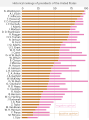 Historical rankings of presidents of the United States
 -
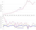
 Global GDP from 2016 to 2050 predictions
 -
 Percentage of usage for top 7 used browsers
 -
 Ranking of births in the US
 -
 Most spoken languages among U.S. citizens
 -
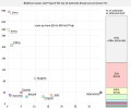
 Sliced treemap showing European Organic Farmland
 -
 Immigration borders per Year and number of immigrants
 -
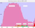 Electricity production in Italy distributed by source
 -
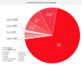 Distribution for Incunabula by language
 -
 Distribution for Incunabula by region
 -
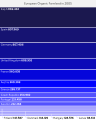
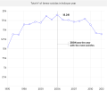
 Cyprus GDP
 -
 Total n° of farmer suicides in India per year


